SCOPE
Brand Redefinition
UI/UX Design
SCOPE
Brand Redefinition
UI/UX Design
ROLE
Led the Project for design and strategy
SUMMARY
Sacet Jewellery
Sacet is a lab-grown diamonds and ethical jewellery store in the UK. I was asked to redesign the brand's colour to make it appealing to a gender-neutral audience and extend the new look and feel to their
E-commerce website.

NO. OF SCREENS
165+ screens
DURATION
2 months
CHALLENGE 01
Transform the brand to a colour that is gender neutral, stylish and sophisticated
CHALLENGE 02
Create a seamless E-commerce experience that ensures sales
DISCOVERY | ANALYSIS
Men visit jewellery websites and stores more often than women
While this information might seem obvious, it was pushed to the forefront as a basis for rebrand through, thorough site wide analysis, accompanied by their in store sales findings.
This information was the driving factor in choosing their fresh colour palette that evokes qualities of balance, growth, luxury and sustainability.
THE STORE
Rebranded Colours
.png)
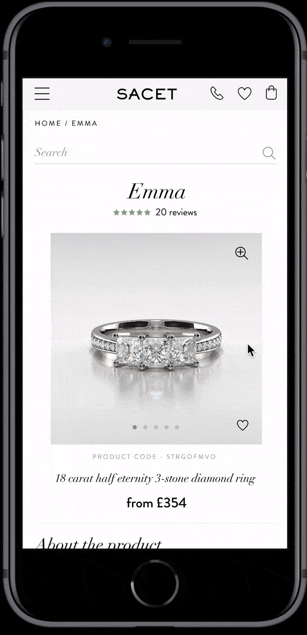
THE WEBSITE
A smoother E-commerce
experience

USER FLOW
Book a virtual
viewing appointment
During the pandemic Sacet wanted to maintain their home trial/ring viewing experience virtually.
We decided to allow the users to book for virtual appointments for rings they had chosen using simple forms that collected very minimal information and easily allowed consumers to ensure the beauty of their intended purchase.
THE WEBSITE
Optimised designs for mobile,
desktop, & tablet


