SCOPE
Brand Redefinition
UI/UX Design
SCOPE
Quantitative Analysis
User Research
Wireframing
Prototyping
Handoff
WORKED WITH
Publicis Groupe
Redesigning the cart page user experience for ITC a large FMCG E-store to reduce bounce rates
by 22%.
ITC is one of India’s earliest private sector companies that is a diversified conglomerate with businesses spanning Fast Moving Consumer Goods, Hotels, Paperboards and Packaging, Agri Business, and Information Technology.
The ITC e-commerce store for FMCG goods boasts a portfolio of 800 products that fall under 20+ sub-brands.

THE PROBLEM
Customers bouncing off the cart page due to hidden extra costs (shipping, tax, fees)

THE SOLUTION - A REDEVELOPED CART PAGE
Informing customers about shipping charges &
other fees.
The charges the customer would have to pay for the entire order was explicitly indicated on the cart page and cart drawer with a breakdown of costs
Explicitly indicating to customers how much
they need to spend to get free shipping.
-
Using gamification UI elements customers are explicitly shown how close they are to obtaining free shipping.
-
This fulfils the business goal of the increased average cart order value and benefits the customer who gets free shipping


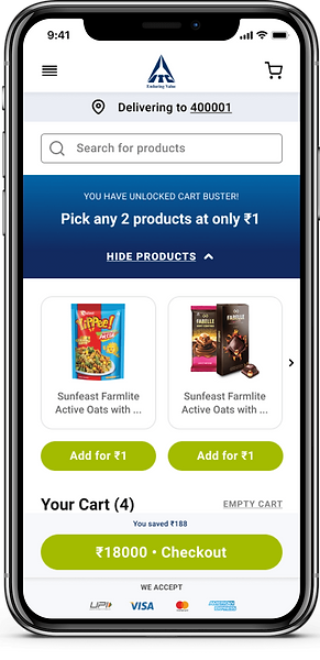
Showing all acceptable modes of payment on cart drawer and cart page.
Customers do not have to wait until they reach the checkout page to know what modes of payment are accepted on the website
Allowing users to checkout as a guest
-
By default, the cart page allows users to checkout as a guest.
-
However, users are given an incentive of 10% off their first purchase if they create an account, this meets a business goal of onboarding genuinely interested users

RESEARCH BY BAYMARD STATES
47% people abandon the checkout process due to hidden costs.
33% average conversion rate increases from better checkout design.

QUANTITATIVE USER RESEARCH DATA
60.7% of ITC customers abandon their journey from the cart page
An online survey was used to validate the reasons for cart abandonment
-
48% of users stated that they quit the cart journey due to hidden shipping costs and other fees
-
25% quit since they could not accurately calculate the total amount due
-
12% abandoned due to not being able to complete checkout with a guest account
-
15% quit due to not knowing what modes of payment could be used to complete the purchase
3 MAJOR IMPROVEMENTS TO THE USER EXPERIENCE & DESIGN
Use of a delivery date and not delivery speed
According to Baymard, use of delivery speed (delivery in 2-3 days) is ambiguous and users prefer specific dates during the checkout process
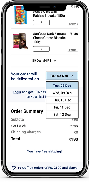

Notifying users of out of stock products, discount obtained and allowing easy removal of products
Introducing discounted products section that the user can expand and collapse as they need
The final product
THE DESIGN SYSTEM


RESULTS
Increase in conversion rates and reduction in exit and bounce rates by 22% within a period of 3 months
This initiative along with restructuring the IA, home page flow, pincode/location selection journey, product description page layout, creation of a health corner section, blog pages, brand pages and more led to a significant reduction in the bounce rates of the website overall.
Over 3 months there was also a 140% increase in the conversion rates of the ITC website which was a major success.
WHAT I'D DO DIFFERENTLY
Conduct user testing on initial prototypes
According to Jakob Nielsen from NNG, it is advisable to test with fake users rather than not testing at all.
Due to budget limitations and time constraints, the team and stakeholder-approved solutions for the cart page were deployed without any user testing which is something I would ideally rectify.
Fine-tune accessibility
I would also rework the existing design language with more accessible colours and typesetting which could not be changed in the current version due to the established brand design system.
Gymzilla Gym Website
Usability and Accessibility Testing for a Startup
fitness brand to reduce exit rates by 25%